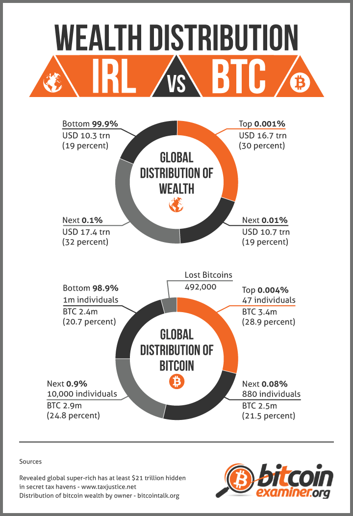
Although Bitcoin is considered a democratic currency, its distribution is now strangely similar to the unfair division of wealth that characterizes fiat currency across the world.
Here’s a visual explanation brought to you by Bitcoin Examiner that shows how both types of currency are now distributed.


Neal is totally right. That is the most deceiving chart I have ever seen.
This chart is obviously wrong, everyone know that most of the money belongs to federal reserve banks, which is privately owned
They only look “strangely similar” if you don’t divide them by the same ownership percentage.
It requires 4 times as many participants to get the top 30% in bitcoin (0.001 vs 0.004).
It requires 8 times as many participants to get the next 20% in bitcoin (0.01 vs 0.08).
The next section compares a group 9 times as large in the bitcoin world, and find 1/5 of the pie vs 1/3 of the money pie.
So it seems there is still a skew, but far less than in the fiat money world.
Yep. Here’s a very rough chart with equivalent ownership percentage. I made this really quick, split between 0.001 and 0.1 may be off by 10% of the pie or so.
http://i.imgur.com/Sr2selL.png
Maria, have you read “How to Lie with Statistics”?