A major signal has appeared on the Bitcoin Rainbow Chart with big Bitcoin price implications ahead of Halving 2024, but retail investors globally are asking ‘what is the Bitcoin Rainbow Chart?’. Explore this deep dive into the Bitcoin Rainbow Chart and discover how it signals Bitcoin price moves.
Knowing when to buy and sell Bitcoin requires more than a gut feeling; it demands an intimate knowledge of historical trends and a sophisticated understanding of current market data.
This is where tools like the Bitcoin Rainbow Chart come into play for everyday retail investors, offering a visual way to gauge the next Bitcoin all-time high.
Deep Dive: What is the Bitcoin Rainbow Chart?
Once a meme among the crypto community, and still hotly debated as one, the Bitcoin rainbow chart has risen in popularity to become an Aladdin’s lamp of Bitcoin price forecasting.
By rubbing its logarithmic curve, investors and traders can summon insights into BTC’s price direction, making it an invaluable genie in the volatile crypto market.
As we approach the end of Q1, all eyes are on the upcoming halving 2024, expected to induce the next move to a new Bitcoin all-time high.
While predicting the price of Bitcoin markets is never guaranteed, tools like the rainbow chart can help us navigate the way. Here’s everything you should know about the rainbow chart and its predictions for Q2 2024.
Ahead of Halving 2024: What Does Bitcoin Rainbow Chart Mean For Bitcoin Price?
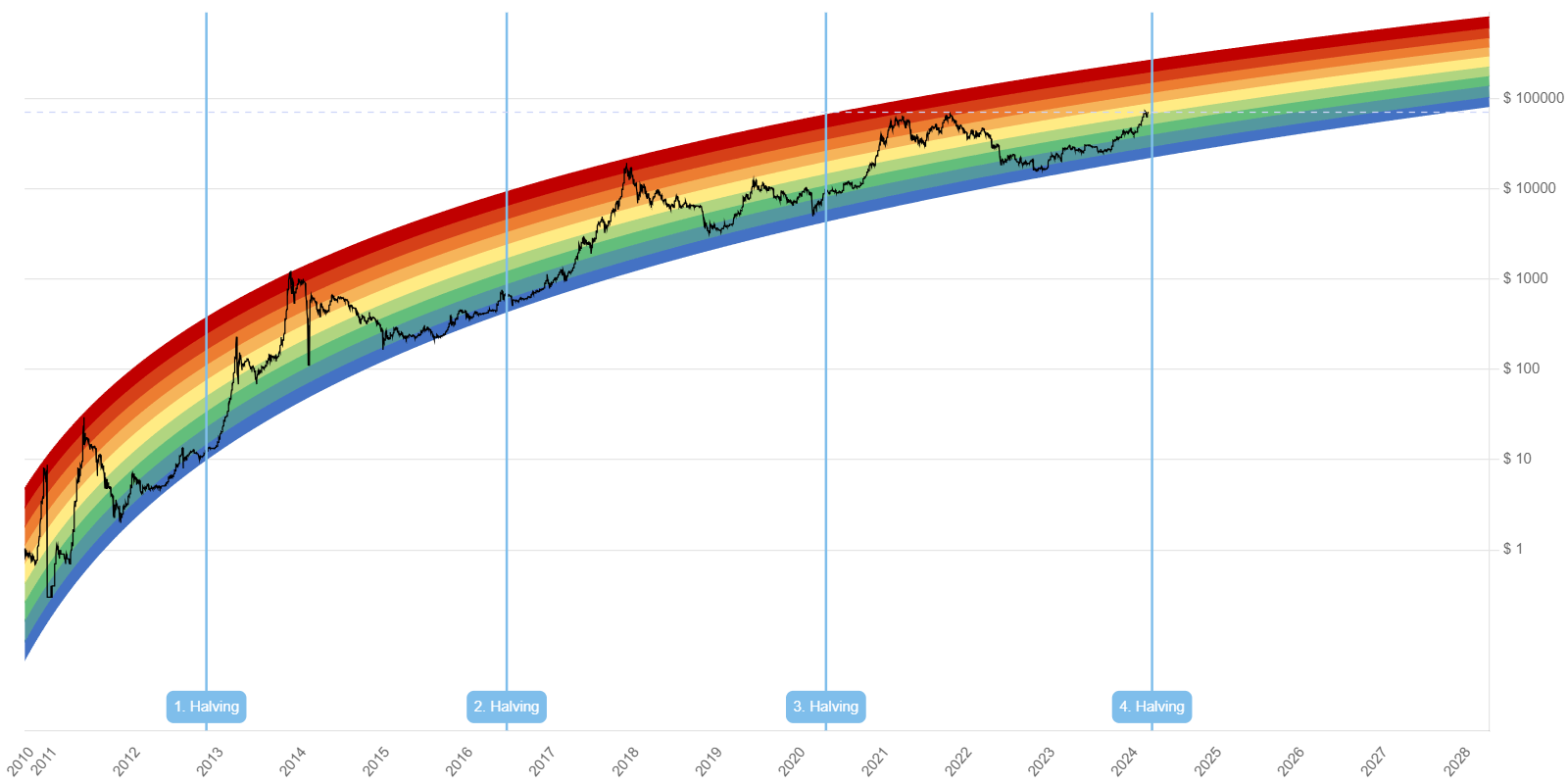
With origins on OG Bitcoiner forums, the chart was created by a Bitcointalk user “trolololo” in 2014—further cementing its meme status—and then further developed by Über Holger to employ a logarithmic regression method.
This approach plots Bitcoin’s price evolution over time, using color-coded bands to signal potential buy, sell, or hold phases based on the cryptocurrency’s long-term value.
The ten bands of the rainbow chart represent these categories:
- Purple: Bitcoin is Dead
- Blue: Basically a Fire Sale
- Bluish-green: Buy
- Green: Accumulate
- Pale green: Still Cheap
- Yellow: HODL (This Is Bitcoin’s Current Signal In March 2024)
- Light orange: Is this a bubble?
- Orange: FOMO (Fear of missing out) intensifies
- Red: Sell now
- Dark red: Bitcoin all-time high; maximum bubble
Unlike linear regression, logarithmic regression is used for data showing rapid growth or decline followed by a plateau – investors like Raoul Pal call this the “Exponential Age.”
What if GDP doubled in a year? 🤯
On today's Raoul Pal the Journey Man episode, @RaoulGMI had the pleasure of presenting his Exponential Age thesis and more on The @JuliaLaRoche Show.
Watch it on YouTube 👉 https://t.co/8Jre9XwXBD pic.twitter.com/7ALA17bWMh
— Real Vision (@RealVision) November 29, 2023
Although the rainbow chart has been historically accurate, it was wrong in 2020 and 2022 when the price fell twice below the blue band (basically a firesale).
However, the band held on as everyone and their mothers expected $10K Bitcoin, which would have shattered the chart.
This prompted an update with another band below the “Basically a Fire Sale” titled ‘1 BTC = 1 BTC’ as a joke until the new “Bitcoin is Dead” band.
As most of us know, when the media declares BTC is dead, it’s often the best time to buy.
What Will The Bitcoin Price All-Time High Be?
By aligning the color bands with the pre-halving and halving cycles, the Rainbow Chart offers insights into Bitcoin’s future price.
Historically, bull runs tend to occur approximately a year after a halving, putting the top of the emerging cycle out in 2025. Moreover, popular technical analysis tools like the Fibonacci retracement and extension levels provide additional insights.
By examining previous rallies and their subsequent 500% extension levels, we can predict future price peaks – indeed, current trends suggest Bitcoin may reach a maximum of $200k by September 2025.
Beyond the rainbow chart, other on-chain metrics, like the Net Unrealized Profit/Loss (NUPL) metric, provide additional context on Bitcoin holders’ overall profit or loss status. A rising NUPL trend indicates increasing profitability among investors.
The Bottom Line: Bitcoin Rainbow Chart
In summary, the Bitcoin Rainbow Chart serves as a creative, albeit not totally scientific, tool for visualizing the next Bitcoin all-time high.
The creators themselves said the chart is “pure entertainment” (basically saying ‘not financial advice’), yet, despite its meme magic, the chart provides a unique lens through which investors can assess long-term trends and sentiment shifts.
Explore: What is DePIN? Here Are 3 DePIN Crypto To Watch – March 2024
Disclaimer: Crypto is a high-risk asset class. This article is provided for informational purposes and does not constitute investment advice. You could lose all of your capital.
Why you can trust 99Bitcoins
Established in 2013, 99Bitcoin’s team members have been crypto experts since Bitcoin’s Early days.
Weekly Research
100k+Monthly readers
Expert contributors
2000+Crypto Projects Reviewed